Avoid using UPPERCASE LETTERS. Our visual expression becomes easier to read by using lowercase letters.
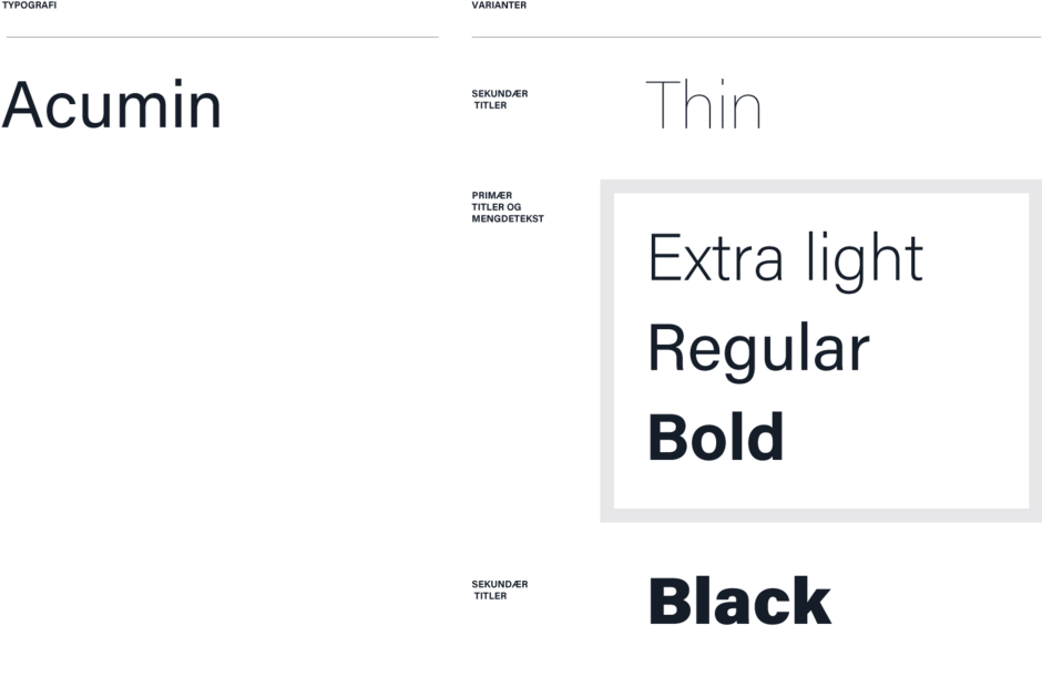
UiA has decided on 6 different weights of Acumin. If you do not have access to Adobe's programs, you can use the alternative font Arial.
The font becomes more expressive in the thinnest and boldest variants.
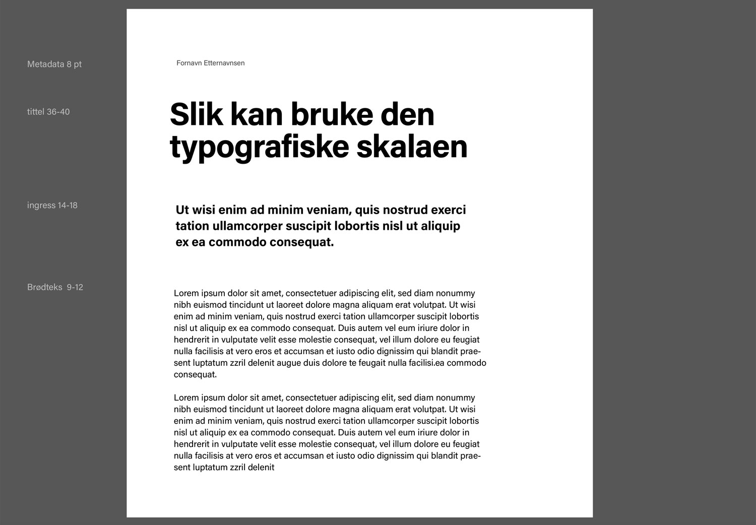
Body text for a standard document should be set at 10 pt.